Apotheca
Apotheca Medical Supplies, a provider of diverse medical products and equipment, sought to refresh their branding and logo to better align with their mission. Nectar was chosen to revamp their image and capture the essence of Apotheca’s commitment.
The objective was to develop a refreshed identity for Apotheca, highlighting their medical supply expertise, preserving their reputation, and designing a distinct logo and brand identity to set them apart from competitors.
Client
Apotheca
Année
2016
Services
Branding
Logo
Website Design
Prix
Concours de polices de caractères
Prix D&AD
Nectar's work with Apotheca revitalized their image and strengthened their market position. The updated branding and logo captured the company's commitment to providing high-quality medical supplies, fostering a bright future for the business.
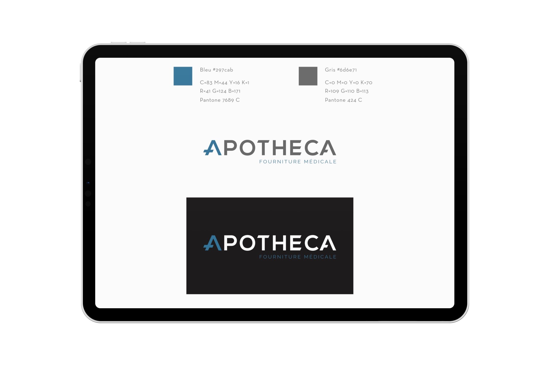
Nectar conducted market research, analyzed competitor branding, and considered Apotheca’s brand story and values. The team explored various logo concepts before finalizing a cohesive visual identity system, including typography, color palette, and imagery.
The rebranding and new logo resonated with Apotheca and their audience, enhancing brand recognition and differentiation. The transformation increased engagement on digital platforms, aligned the brand with core values, and boosted credibility with potential clients and collaborators.


