Why Your Website Needs to Be Responsive
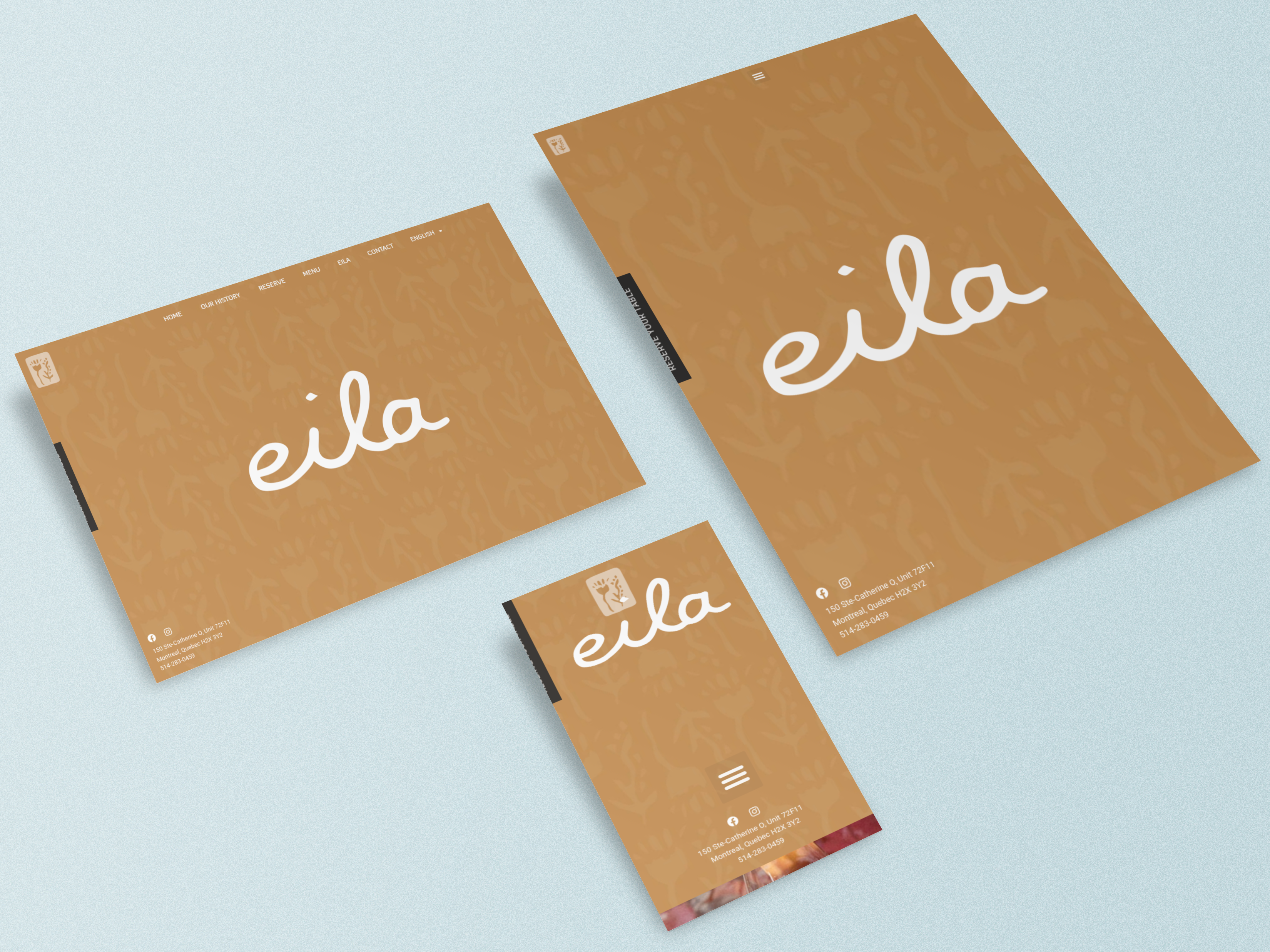
Simply having a website isn’t enough. With people accessing content on a wide range of devices, from smartphones to desktops, your site needs to adapt seamlessly. Enter responsive web design—an approach that ensures your site looks great and works flawlessly, no matter the screen size.
What Is Responsive Web Design?
Responsive web design allows your website to automatically adjust its layout, images, and content to fit the device it’s being viewed on. Whether it’s a tablet, smartphone, or desktop, your site will provide a consistent and user-friendly experience.
Why You Need It
1. User Experience First
A responsive website ensures visitors enjoy an intuitive, smooth experience, whether they’re browsing on mobile or desktop. This keeps them engaged and more likely to convert.
2. Mobile Traffic Matters
With over half of web traffic coming from mobile devices, optimizing for mobile is crucial. If your site isn’t responsive, you’re potentially losing out on a big chunk of visitors and customers.
3. Boost SEO
Google prioritizes mobile-friendly websites in search results. A responsive design can help you rank higher and drive more traffic.
4. Cost-Effective
Instead of creating separate websites or apps for different devices, a responsive design saves time and resources by managing everything on a single platform.
5. Future-Proof Your Site
Responsive web design ensures your site will work on new devices and screen sizes, keeping you ready for the future of digital.
Our Final Thoughts
Responsive web design is no longer a nice-to-have; it’s essential. By making sure your site adapts to any device, you’re improving user experience, boosting your search engine ranking, and preparing your business for the future.
Ready to go responsive? We’re here to help. Reach out to start your project!